AI apps spend a meaningful portion of every interaction in a waiting state. How that waiting feels is a UX decision, not a technical one. A spinner says "we forgot to think about this." A well-crafted progress narrative says "we know what is happening, and so do you."
The hierarchy of loading
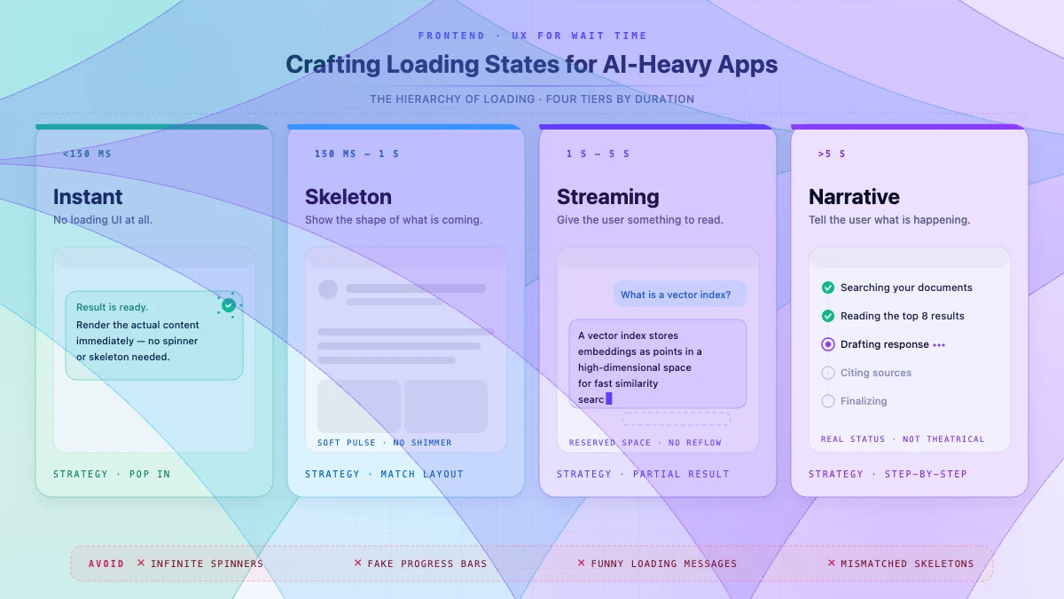
- Instant (<150ms): no loading state at all. Reserving a placeholder is more disruptive than just popping the content in.
- Short (150ms-1s): skeleton screen. Show the shape of what is coming.
- Medium (1s-5s): streaming or partial result. Give the user something to read.
- Long (>5s): progress narrative. Tell the user what the system is doing.
Skeleton screens that actually help
A bad skeleton is just rectangles. A good skeleton matches the layout, hints at the content density, and avoids the shimmer animation that has become a cliché. We use static skeletons with a soft pulse, never a sweep.
Streaming placeholders
When the response is coming in chunks, render the chunks as they arrive, with reserved space for what is missing. We covered this in our streaming UI post, and the same principle applies to any partial result.
Progress narratives
For anything that takes more than 5 seconds, show the user what is happening: "Searching your documents... Reading the top 8... Drafting response..." It transforms "the app is slow" into "the app is thorough."
Real status, not theatrical status. If the step you are claiming to be on is not actually what is running, users will catch you.
What to avoid
- Spinners that spin forever with no other signal. Universally a "this is broken" cue.
- Fake progress bars. Users learn to distrust them within one use.
- Funny loading messages. They were charming once. They are noise now.
- Skeleton screens that do not match the eventual layout. The pop-in becomes the worst part of the experience.